Layouts in Flet
GUI app development with Python & Flet
🕑 This lesson will take about 30 minutes
Flet offers a range of different ways to layout content in an application, including:
Containers
Columns
Rows
Cards
DataTables
GridViews
ListViews
Pagelets
Stacks
Tabs
VerticalDividers
and more
Some of these layouts can be used together. For example, a Container can be placed inside a Row. We won’t look at all of the different types of layouts in this lesson, but we will work with some examples. If you’d like to check out all of the different types of layouts available to use, you can refer to Flet’s documentation on layouts here.
Containers
Containers allow you to decorate a control (such as a button or text) with a background colour and border, and to position it with padding (spacing on the inside of the container), margin (spacing around the outside of the container), and alignment. Containers can be placed inside other layouts such as a Row.
Here is an example of three containers each containing a button. Each container also has a different background colour.
The above code would produce the result shown in the screenshot below.

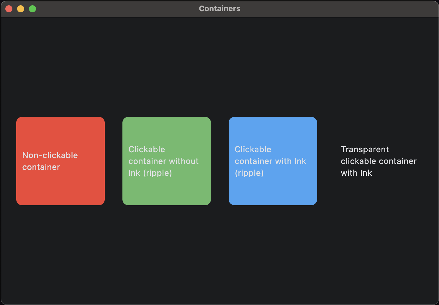
In the example below, three Containers are added inside a Row. Each container has a different background colour. One container is non-clickable, the next is clickable without Ink (a ripple effect when the control is clicked), the next is clickable with Ink, and the last is transparent with Ink. The code also shows how to set other properties of containers such as width, height, margin, padding, alignment, background colour (bgcolor), border radius (for rounding the corners of the container), etc.
The above code would produce this result:
Columns
A column is a control that displays its children (other controls) vertically.
The code above creates two containers and places them inside a column. There is also some spacing between each container within the column.

Rows
A column is a control that displays its children (other controls) horizontally.
The code above creates two containers and places them inside a row. There is also some spacing between each container within the row.

Cards
A Card is a panel that follows the Material design theme and has slightly rounded corners and a shadow behind it. Here is an example of a Card in Flet. Note that there is an icon next to the text inside the card. If you’d like to use icons in your app, you can find them in the Flet Icon Library. Just replace the name of the icon (eg. icons.ONDEMAND_VIDEO ) in the sample code below with the name of the icon you prefer to use.
The screenshot below shows a Card (using the code above). The card has a heading, some text and an icon, and two buttons.

DataTables
A DataTable can be used to display data in a table made up of rows and columns. Where rows and columns intersect in a table is called a DataCell. DataTables can also be styled (eg. using different background colours and borders), sorted and have checkboxes. Check out the full documentation on the Flet website here. Below is some example code for a simple DataTable.
Here is an example of a DataTable using the above code.

GridViews
GridViews are an effective layout to use for displaying large lists of items such as images. It allows for smooth scrolling and content can automatically adjust if the window size changes. The following code uses a GridView layout to display 60 random images from the picsum.photos website.
Here is an example of a GridView layout for a photo gallery using the above code.

ListViews
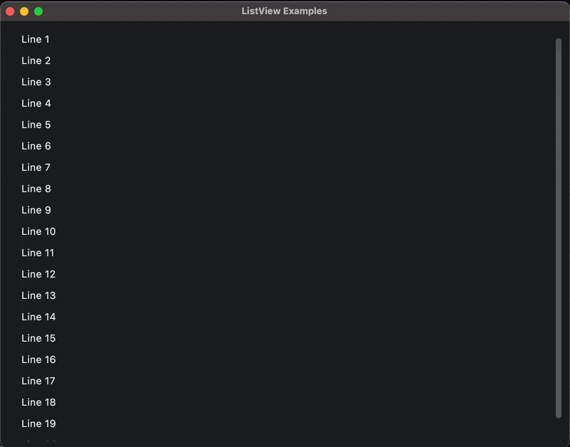
A ListView can be used to create a list of items. They are very effective for large lists (thousands of items) and offer smooth scrolling. ListViews can automatically scroll as new items are added to the list. The example code below shows how to add a regular list and an auto-scrolling list that is being populated with a new item each second.
Here is an example of an auto-scrolling ListView using the above code.
Pagelets
By now, you should be familiar with Pages. A page is an individual screen in a Flet app. Pagelets, on the other hand, are a "page within a page" layout. A pagelet has its own AppBar, BottomBar, Drawer, such as demos and galleries.
Next lesson: Navigation