Getting user input in a Flet app
GUI app development with Python & Flet
🕑 This lesson will take about 30 minutes
There are a number of different ways that input can be collected from the user, including:
Buttons
TextFields
Checkboxes
Dropdowns
Radio buttons
Sliders
Switches (toggles)
Date and time pickers
Range sliders
Search bars
Buttons and the click event
Buttons are an essential part of an app’s UI. Buttons generate a click event when pressed. In the example code below, there is a Button control and a Text control. When the button is clicked, it generates a click event which calls the button_click() function. When this function is called, the text is updated to display a message.
The code above will display a window with a button. When the button is clicked, the message "You clicked the button!" is displayed below the button, as shown in the screenshot below.

The code below shows how to achieve the following:
add a title to the app’s UI window
centre the content on the screen
set the width and height of the window/page
disable resizing of the window/page
change the background colour of the window/page
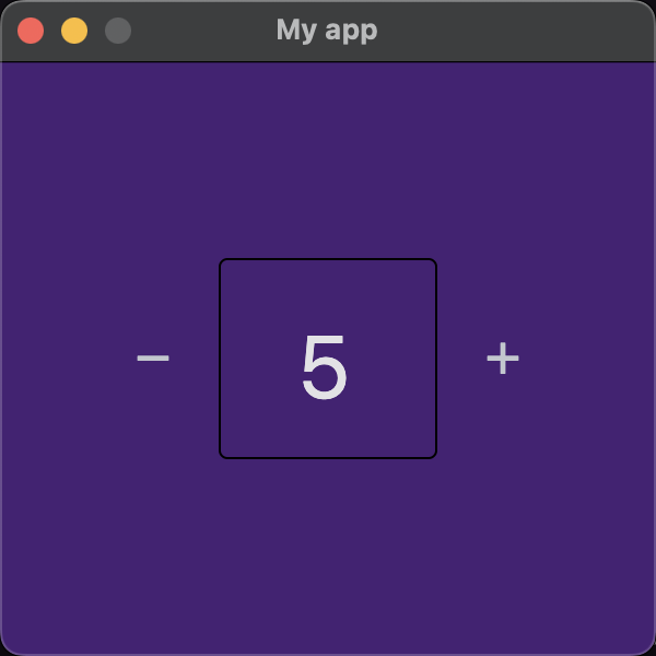
add a row (containing two Buttons and a TextField)
In this example, the app is a counter app - there are two Buttons with plus and minus icons, and a TextField in between the two buttons. When the plus or minus button is tapped, the number in the TextField is increased or decreased.
To change the background colour of the app’s window (page) and the colour of the text in the TextField control, hexadecimal colour codes are used. Hexadecimal colour codes begin with a # character and are made up of a combination of 6 characters (which can be numbers 0-9 or letters between A-F). You can use a colour picker website or app to generate a hexadecimal colour code for your preferred colour.
The screenshot below shows the result of the above code.
TextField
Flet provides a range of different controls for creating forms, including:
TextField
Checkbox
Dropdown
ElevatedButton
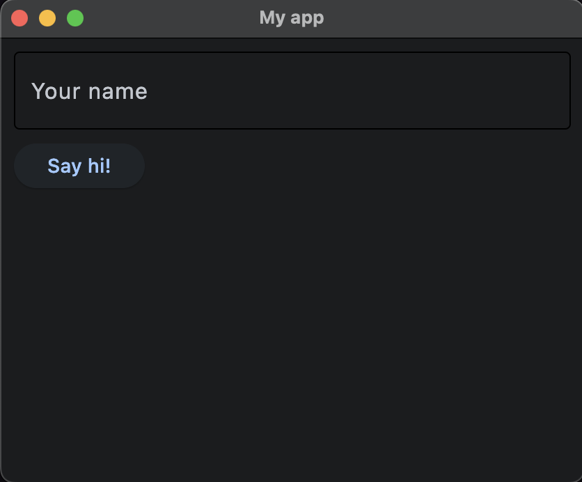
Let's look at a simple example of a form with a TextField that asks the a user for a name and then a Button to capture their input. In this example, we’ll also use the page.clean() function to wipe existing controls from the page before displaying some text to the user after they have entered their name and clicked the button.
Here is a screenshot of the app using the above code.
Checkboxes
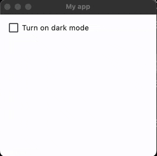
Here is an example of a an app with a checkbox that has an on_change() event. When the checkbox’s value has changed (eg. it has been checked or unchecked), it calls the function checkbox_changed() . This function then sets the window to dark or light mode and displays the value from the checkbox using text.
And here is the result:
Dropdowns
A dropdown allows the user to select from a number of different items. The dropdown shows the currently selected item and an arrow that reveals a menu for selecting another item. You can also specify a label for the dropdown and a hint - the label and hint will show before the user selects an item. In the example below, a dropdown menu has the label “Favourite programming language” and the hint “Choose your favourite programming language”. When the user selects the dropdown, a list of options will be shown (eg. “Python”, “Javascript”, “C”, etc.). The user can then select one of these options.
Here is an example of the dropdown in use.

Radio buttons
Radio buttons also allow the user to select an item from a list of options. Unlike checkboxes, the user can only select one item at a time (checkboxes allow the user to select none, one, or more than one item at a time). Radio buttons appear as circles, whereas checkboxes appear as small squares. Here is an example of a radio button in Flet.
And here is an example of the radio buttons in use:

Sliders
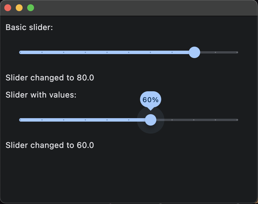
A slider is a horizontal bar that allows the user to select a value from a range of values, and provides a visual indication of the range of values as well as the current selected value in the range. Sliders are often used to set defined values such as volume or brightness.
In the example below, there are two sliders. Each slider has a range between 0 and 100. The first slider is a basic slider where the user can click and drag the circle to change the slider’s value. The second slider shows the current value above the circle while it is being dragged by the user.
And here is what the sliders look like:
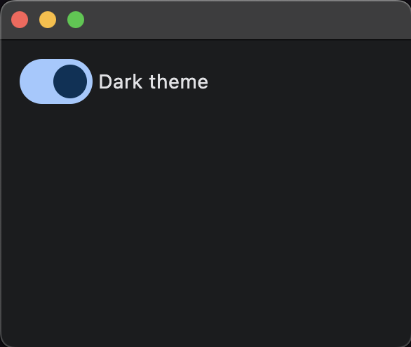
Switches
A switch is a toggle that resembles a physical switch and allows the user to choose between two options, for example, "on/off" or "show/hide".
The above code will produce the following result:
You can refer to Flet’s official documentation for other types of inputs, including:
Next lesson: Dialogs